|
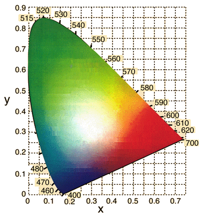
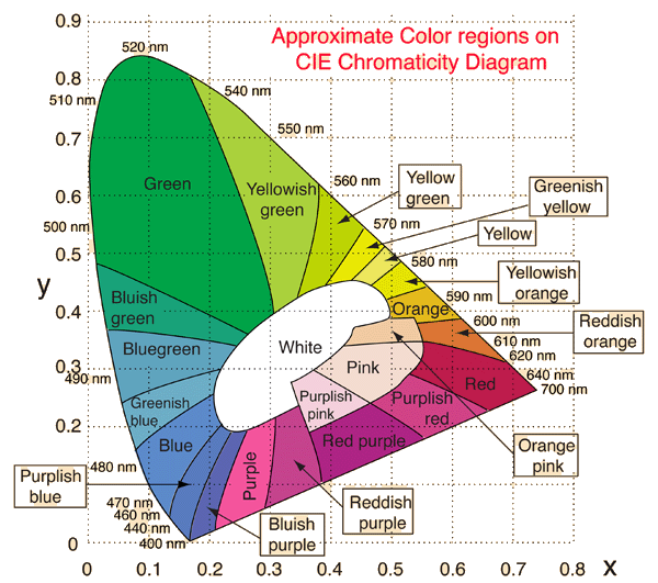
Approximate colors can be assigned to areas on the CIE Chromaticity Diagram. These are rough categories, and not to be taken as precise statements of color. The boundaries and the color names are adapted from Brand Fortner, "Number by Color", Part 5, SciTech Journal 6, p32, May/June 1996.
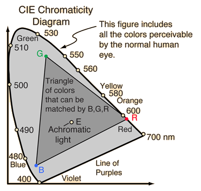
Any attempt to depict the gamut of human color vision on a computer monitor must be accompanied by numerous qualifications and exceptions. In the first place, you cannot display the range of human color perception on an RGB monitor - the gamut of normal human vision covers the entire CIE diagram while the gamut of an RGB monitor can be displayed as a triangular region within the CIE diagram. Another qualification is that the hue and saturation associated with a given color name can vary over a considerable range. Add to that the variations with different kinds of display monitors, and you rightly conclude that an accurate rendition is impossible. With all those excuses, however, it still might be instructive to provide a rough idea of the regions of the CIE Diagram associated with common color names.
The display here was created by choosing representative RGB values for the color regions from a rendition of the 1976 CIE Chromaticity Diagram provided by Photo Research, Inc. Note that one representative value in about the middle of the hue and saturation ranges was chosen for each section of the diagram. The point chosen was just a visual judgment of a representative color in the range. The RGB values obtained are listed in the table at right. A different observer would likely have chosen different points to represent the color names, but at least these values might provide a starting point for preferred variations.
One characteristic of the commonly used 1931 CIE Chromaticity Diagram that is evident even from this crude portrayal is that the green takes up far too much of the landscape compared to the number of visually different colors in the region. That was one of the shortcomings that the 1960 and 1976 revisions sought to address.
|
| Color name | Red | Green | Blue |
| Red | 191 | 27 | 75 |
| Pink | 245 | 220 | 208 |
| Reddish orange | 216 | 119 | 51 |
| Orange pink | 240 | 204 | 162 |
| Orange | 228 | 184 | 29 |
| Yellowish orange | 231 | 224 | 0 |
| Yellow | 234 | 231 | 94 |
| Greenish yellow | 235 | 233 | 0 |
| Yellow green | 185 | 214 | 4 |
| Yellowish green | 170 | 209 | 60 |
| Green | 0 | 163 | 71 |
| Bluish green | 24 | 162 | 121 |
| Bluegreen | 95 | 164 | 190 |
| Greenish blue | 110 | 175 | 199 |
| Blue | 92 | 138 | 202 |
| Purplish blue | 88 | 121 | 191 |
| Bluish purple | 92 | 102 | 177 |
| Purple | 246 | 85 | 158 |
| Reddish purple | 196 | 64 | 143 |
| Purplish pink | 243 | 208 | 219 |
| Red purple | 175 | 35 | 132 |
| Purplish red | 209 | 65 | 136 |
| White | 255 | 255 | 255 |
|